Friday, 22 April 2011

Personal Review Of The First Year


One of the first things I would like to see more of is the staff. 
I realise that it has been an extremely difficult year for them, this time around. 
Lots of tumultuous incidents and unfortunate events. 


I really sympathise, but it is necessary to have more interaction, so we can improve and gain more confidence. 
Mainly though, we are interested in what you have to say "oh wise ones!" :D 


I've gained a lot of insight from the critical studies lessons. I enjoyed the method of presentation and it made it easy to absorb. 
It also teaches us how to use artistic judgement more constructively. And how to perceive the choices others have made, artistically and with relevance.


(This is just for an example - Although I have drawn in a vaguely similar style in the past, I do not like Anthro art!) 


I can't put this persons name on here, it just wouldn't be right. 


They obviously have skill. But it creeps me out when I look at it!


Urgh! Here is an actually Anthro Fox.
I feel like my eyes are dirty!
This is all kinds of wrong.
I would never presume to think that I am more knowledgeable than any one else, I am a little older than most on the course, yet I'm still learning, always will be. 


All I know is, I want to know a lot more! :)
So I can make the right decisions with my art.


Feed your Braaains!
I've had some sleepless nights tackling 3Dsmax. But despite that fact, I have enjoyed it! 
(I've also loathed and detested it ;p) 
But I'm a lot happier with my progress now. I've just come to accept that when I do a 3D project, random sh*t will happen. 
Thank you for your patience Heather :)


I think that I've demonstrated good progress with the software, especially in the last project - Weapon of Choice
Weapon of Choice  - Murasame Blade


For once it was smooth sailing! Not one problem :D 
When I look back at the first few weeks of the year, I can't believe that I could produce something like this so soon. 
I'm quite proud of how it turned out. 


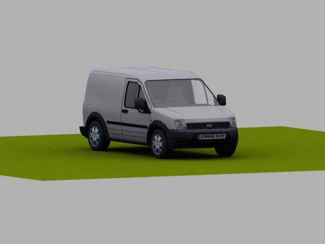
The Vehicle project really taxed my abilities at that time. 
I really wanted it to be precise when I submitted it. 
It was the best I could do at that point in the semester. But overall, I'm pleased with the end result. 
It looks like a van! (A very tiny van)


Also my Gurus Project looked quite tidy. 
I learned why a Poly budget is advised! I had none left for his zip :( 
When it came to laying out my textures, I had no clue.


When I start the second year I hope to have mastered laying out an efficient texture template. 
I still look at UVW's and think "where do I start?"

I really need to make a few different character models to experiment with varying body types. 

Even though I've always made an effort to understand anatomy when drawing, it wasn't entirely accomplished with my Gladiator Model -


 -----------------------------------------------------------------------------------------------------


I'm beginning to like my visual design work again. 


I started off the year very confident and lost that somewhere along the way. 


I sat for hours sketching this :)


I think it was just the gaps in my knowledge using traditional media. Yes, I can draw. But paint?


I couldn't remember how to use a brush, it had been so long! I knew that I would never be any good, especially in my own eyes, if I didn't start with the basics all over again. 


Acrylics - I tried to emulate the lividity of my skin.
If you look at my wrist you can only just see two large blueish veins.

I tried to emulate a Water-Colour style in Photoshop.
It's good progress. I'm getting better.


I played around with custom brush settings for this image.
It helped especially with the foliage as each plant is so different.


I'm getting a lot more confident again. 
I need to think about my points of interest in my images in the future. Some aspects of the subject matter can be changed or removed to improve the composition. 


Overall I feel there is still so much to learn. I need to relax more when I work too. 


Here is an image I drew in Painter just before we started the course - 


It isn't great. It's not even finished! But I was totally relaxed when I worked on it. 


I feel I stressed myself out in the middle of the first semester and couldn't concentrate properly.
I was operating like it was a race to the finish. Subsequently I did very little prep work and just threw myself into final pieces. 
Well, I realise I won't learn anything with that approach. If only I'd realised sooner :)


Luckily Chris was continually supportive throughout the whole period.

 I think it would be good to observe Chris producing some work alongside us. So we can see how to apply this artistic judgement we are developing. :)


Maybe if we all sat and painted the same subject? 
I know a lot of the work is self directed study but I really enjoyed the moments when everyone was in the same room working. It just felt good! 


I think that is why some people fell behind. If we're all grouped together there is always someone  to ask for advice or opinion on their own work. 


The workshop that Mike Pickton and Tristan put together at the end of semester two was a great idea. It was very positive and constructive. I think it should be a regular occurrence. 


------------------------------------------------------------------------------------------------------------


I recently played a Board Game (of sorts) called Identik by Asmodee 


http://asmodee.com/ressources/jeux_versions/identik_6.php


It really encourages artistic judgement and conveying visual information efficiently to the other players. 
And it was fun
 (I should have just said visual communication! Fail!)


What decides the winner is not necessarily artistic ability but also the ability to interpret the key elements that make up the whole picture. 


Read the description below - 


The drawing game where drawing talent is optional!

Each round, one player (the Portrayer) describes an image, while the other players (artists) draw the image using a list of hidden criteria. The more details the Artists get right, the higher their score.

Features

-Innovative drawing game
-No ''down-time''- all players play every round
-Guaranteed laughs
-Great for parties


(£23 on www.amazon.co.uk)


Someone may discover they have the latent abilities of an Art Director waiting to blossom.
Maybe we could invest in a copy? Or just simulate the rules? 


It's the process I'm interested in exploring with the class.


------------------------------------------------------------------------------------------------------------


We could all benefit from combining all our resources as well. 
Between us we have a wealth of tutorials and videos that some have yet to discover. 
And the library, although it has a vast selection, is missing some vital sources. 

We also need to discover some new locations to study for visual design. 
Although I would love to help get our current options reopened, I just don't believe they will ever get enough funding to maintain them and that is very sad. 
Meanwhile we're missing out on visiting stimulating places. We need to feed our brains!
(With the exception of Bradgate Park, which is awesome)


----------------------------------------------------------------------------------------------------------


I did find an alternative Pumping Station in Nottingham. :)
It would require the hiring of a mini-bus though.


http://www.papplewickpumpingstation.co.uk/
montarge
The Beam Engines inside are lovingly cared for by the staff. 
You can walk right up to them too! No barriers!


-------------------------------------------------------------------------------------------------------


The situation needs a lot more dedication and support than we can provide. It's really the public's waning interest that is the cause, something we have little control over. 


Maybe if they set up a themed bar in the museums? 


I joke
But that is probably the most successful route they could take. Especially in Leicester.


I think it is just the state of things at this point in time, our government has almost turned it's back on the arts. 
So let's not rely on them. 


One thing the course needs is recognition. Especially if we are competing to gain the next batch of students paying £9, 000 a year.
Maybe this year we can have more presence at Game City. (Or other conventions)
A stall informing potential students what we do. 
With some of the best examples of student artwork. 


There are a lot of key figures trying to push for a more computer literate educational system. 


http://www.gamesindustry.biz/articles/2011-02-01-livingstone-hope-recommends-sweeping-changes-to-uk-games-education

http://www.gamesindustry.biz/articles/2011-04-21-autodesk-issues-livingstone-hope-call-to-action-article

If we can spread awareness of our course and the industry it is geared towards we can only benefit from the attention. :) 


Maybe an article in http://www.gameindustry.biz/ about the course? 

At this stage, I can't think of a practical solution but I hope what I have said can be of use.

Self Portrait - Acrylic on Canvas
Inspired by Eward Hopper

Thursday, 21 April 2011

Elements of Game Design Part 4: Environment

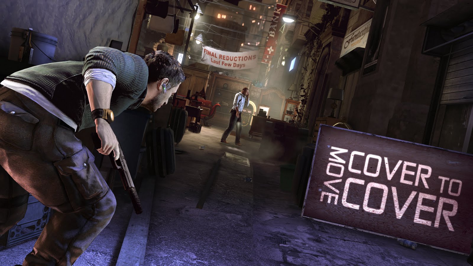
I recently played 'Splinter Cell: Conviction' by Ubisoft
The first level is set in Malta, in the city of 'Valletta' to be exact. 


(1:45 onwards)


Watch these videos and study the architecture around Sam.


Actually when I first noticed this environment, I wasn't playing. It was Inez.
I was on my PC, writing. It was only when I looked over to the TV and noticed the buildings and the streets, that I realised it was Malta because I have been there, once, on a college trip. 

Me - "Holy sh*t! Is this level in Malta or something?" 

Inez - "Yeah, that's right" 

Me - "Whereabouts in Malta? Is it Valletta?" 

Inez - "Yep" "How did you know that" 

Me - "I've been to Valletta, Is there a Port or a Harbour behind you?" 

Inez - "There is!" 

Me - "Wow, that is freaky" "Someone's done their homework" 

It was something like that, I may have cursed more. I realised that I was going to be completely distracted now because of this discovery. There was only one sensible course of action. 

I had to turn off my PC and take notice of this game. 


This is the Level Design for The Marketplace in Valletta
It is a very short stage, basically a corridor design. 
What disguises you from this are the obstacles placed before you and the clever use of low lighting (Only a few areas are lit up).


In this instance you are compelled to go forth. Being channelled forwards by the story line and the construction of the level. 


In other games, such as 'Borderlands' and 'Fallout 3', you roam wherever you choose. (As long as you are equipped to handle it) ;D
We know this as an 'Open World' game environment.


These games differ from Splinter Cell because you are not playing an established character, you are playing as an empty vessel. You determine what kind of player you want to be. 


In Sam Fisher's case, he has to find out the truth about his daughter. Each stage is constructed to direct the plot forwards. 


---------------------------------------------------------------------------------------------------------------


When you look at the image below doesn't it just direct your attention straight ahead? 
The placement of the tables and chairs on your right, present an obstacle to avoid. 
The presence of a wall on your left gives you no alternative route, plus it's littered with people. 
Even the road markings and the buildings themselves creates lines of direction. 
This is an essential technique for Level Design


When you find yourself here -
Look at the people on your right, sitting at the tables.
Some of them are staff from Ubisoft Dev Team :)
The designer has to consider any dynamic action in the level that could cause the player to become disorientated and confused. If there are too many things in the environment, the player will become frustrated. Everything must be composed to maximise the gameplay and the atmosphere of the setting.


---------------------------------------------------------------------------------------------------------------


As with most games you acquire devices (or skills) to help you navigate through approaching perils and obstacles. 
In Sam Fisher's case he gains EMP Grenades, C4 Explosives , Sticky Cameras and a Snake Camera. In the first level he improvises a mirror in the absence of his Snake Cam


Each following stage makes use of these new additions to his arsenal. 
Alternatively you can usually approach the level from a different route to the same end. 


This is important in designing the challenge curve of a level. It should never be catered to one style of play. No one plays the same. 


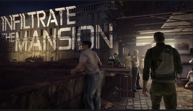
One unique addition to this game is the projected 'objective text' upon the environment 


This helps maintain the 'flow' of the game so your never unsure what you should be doing and where you should be heading.


One thing I love about video games is that if you see a 'Red Barrel' you can guarantee that puppies going to blow up! It is a consistency that speaks to the player subconsciously. 
A common element helps tie-in the gameplay for the player.
---------------------------------------------------------------------------------------------------------------


This probably annoyed Inez immensely when I watched her play through a 'Flash Back' level set in Diwaniya, Iraq. 


Me - "You know.....those red barrels will probably explode if you shoot them" 
Me - "You can kill those guys with just one shot" 
Inez - {-_-} "Really" 


Me - "Its red" "Red barrels always go Boom!"


Inez - "Ooh! That was cool!"
Me - "There is another red barrel there!" "And there!" "On the roof!" "Shoot! Shoot!" \{*u*}/
Inez - 'sigh' "Ok, shut up!" \{>-<}/
----------------------------------------------------------------------------------------------------------------


(I'm trying to dig out my photos of the trip, but I've grabbed these images from http://www.virtualtourist.com
Just to give you a taste of what Maltese architecture looks like


Valletta, the capital city of Malta is a strange place to visit. Essentially it was designed as a fortification for Knights. 
The size of the stairs and streets were specifically designed to accommodate Knights in heavy armour.


Aerial View of St.Julians with Portomaso
St Julians - I believe I stayed in the right hand side
of this image, one of those big square hotels.


Auberge de Castille, Valletta, Malta 2010
Auberge de Castille - Valletta
These were the Inns for the Knights of St John in the 16th Century

Okay, this image of Auberge de Castille illustrates Ubisoft's attention to detail. 
Notice the design of the windows and that every window has green blinds. If you have watched the videos above like I asked, then track the second vid to 3:58. 


Half of the windows you see in Valletta have blinds, green blinds. 
A majority of the doors are green too. (It may be some association with the Knights of The Green, I'm not sure)


In the 16th century Globigerina Limestone was used as the main construction material in Malta. That is what gives Valletta this sandy colour. Unfortunately it doesn't fare well against the sea breeze. 
It can corrode. 
skyline, Valletta, Malta 2010
Baroque style of architecture


Here we go - you can see these details within the first 10 seconds of this video.
Globigerina Limestone, green blinds and another detail I noticed on my stay there, lots of bin bags! They had streets lined with bin bags, very strange.


In my opinion, for this particular level the realism was high. 
Malta has a slight dusty feel it. And you can see this around the floor as you venture through the stage.


A typical Valletta street


Although it is a relatively short stage in the game, it brought back memories of my trip instantly. 


---------------------------------------------------
My memories of Malta are seeing lots of cranes and lots of cats. Everywhere.
I remember we were all walking down to the Harbour, taking in the sights, rounded a corner and it was like west side story of the cat world. 
We had obviously entered into a cat only zone. Honestly. It was a cul-de-sac of cats. 

I tried to play it cool and sit on the nearest wall, amongst the felines, ignoring the hissing and moans. 
No sooner had my cheeks touched the wall when the whole thing toppled over. 
Me and the cats went tumbling into the bushes. Good solid construction!

Needless to say we tore ass out of there!
-----------------------------------------------------


After longer exploration of the game, it is not my favourite level but it invoked an emotional response that I couldn't deny. 
It piqued my curiosity. 


Before I saw this level, I was going get around to playing this game over the summer, to see what Sam Fisher was up to. You see, I've only played the original Splinter Cell
But as soon as I realised the connection I had to the stage that Inez's was playing, I just had to see more of this game.


And it's good. It's a very tidy game. I have no idea why people don't enjoy it. 
A game can not stick to the same format when the main character has evolved (except Pokémon) it just wouldn't make sense! 


This guy is mad as hell and wants some answers. Of course he's going break down some doors! 
He can do stealth. But he can't always afford to wait in shadows. 
This gives the game a good balance in my opinion. And it adds to Sam's character development.


My photos are gone. An unfortunate victim to water damage, a real shame :(


Reminders of British rule
Evidence of the British Empire

-------------------------------------------------------------------------------------------------------------


Who do we have to thank for this great attention to detail? 


Well, these two guys list in their Linkedin profiles that they were the Level Designers for SC: Conviction


http://www.linkedin.com/in/sebastienguay


http://www.linkedin.com/in/jayarsenault


Here are the Developers describing elements of Level Design, Gameplay, Lighting, etc to Machinima.com


Wednesday, 6 April 2011

Elements of Game Design Part 2: Art Direction For Games

The pressure of this job is colossal


Much like an Art Director involved in films (sometimes known as a Production Designer), the Art Director is crucial in overseeing that everything follows the vision and theme of the project. Everything must remain consistent from the main character to the smallest assets. 


Ideally the look and feel must seem fresh and new to the viewer throughout, you don't want to lose their interest for even a moment.


Visual elements that affect the journey of the viewer/player are all decided and considered to maximize the overall experience. An Art Director must understand how to visually communicate to the viewer exactly what is necessary to set the scene. 


Lighting is a key asset in setting the mood without the audience even being aware of it. 


The only source of light can be your greatest a weapon. 


Even with the reassuring glow of sunlight, the environment still feels ominous.
The Art Director can be directly involved in the artwork or manage a group of artist. 
But it is their vision which keeps everything cohesive. 
Artistic judgement is an essential skill in this role. And an understanding of how colours affect our perceptions. 


If an object is red, it is usually associated with danger or heat. 


(In the case of these two images, both)


If a room is red, it can create a sense of anger, lust, a place of violence. 
Yet when used in the subtlest shift of context it appears to reflect courage, romance, royalty and affluence. 


These are just a few examples but with the right setting they can be completely re-envisioned. 


Dark Watch, High Moon Studios 2005 - Concept Art

Twin Peaks - The 'Red Room'
http://www.flickr.com/photos/giuseppelambertino/with/3237722350/
Alice In Wonderland 2010 - The Queen of Heart's Throne Room

Castle-Zvahl-Throne-Room-Wartime.jpg
Final Fantasy XI: WOTG - The Throne Room of the Shadow Lord

File:FFIVDS Dwarven Castle Throne Room.png
FFIVDS: Dwarven Castle Throne Room


The Throne Room at Buckingham Palace. Photograph: Rex features

Miramare Castle -Trieste

Prince Of Persia: TFS 2010
Look at these links - 
http://www.informationisbeautiful.net/visualizations/colours-in-cultures/


http://en.wikipedia.org/wiki/Color_symbolism


Basically an Art Director must have the ability to unify the specific aesthetics of the project.
This could be spread amongst an impressive team of creatives, so one would have to be able to manage all of these individuals to achieve the finished product. 


Like I said the pressure of this particular job is colossal. 
You would need to be wise beyond your years to approach this role early in your career.
-------------------------------------------------------------------------------------------------------------------------


Inspiring Visuals


I remember late one night, seeing Guillermo Del Toro's 'CHRONOS' (I believe I was about 14). 
It was a odd film. But it really stuck with me. It was like an alternative Vampire story. 
(Not in any way, shape or form like 'Twilight').


Since then I have been following Del Toro's film making with hungry eyes. 


His style has really shone through within the last 10 years. 
Even when a scene is intended to be dark and moody, the frame is always rich with colours and interest. 


Whomever Del Toro chooses as AD for his films, that consistency has been present throughout. 


On HellBoy and HellBoy II, the Art Direction was steered by Stephen Scott

Lots of contrasting colours set the characters apart from the scenery.
Cold blue scenery, warm orange lighting.
The character blends into the murky scene to give the point of interest more emphasis.
In this case the glowing eggs of a 'Hell-Hound'. Yuck!
The contrast can be seen more clearly in this shot.

John Hurt as Professor "Broom" Bruttenholm.
In this scene we have red carpet on a blue tinged floor, yellow lighting from above and an orange side light.

HellBoy 2004 (I have noticed, a circle of blood recurring in his recent films).
The 'Ogdru Jahad' descending from space.
One of the seven 'Ogdru Jahad' Escaping it's prison in space.
Their appearance is inspired by the 'Great Old Ones' that author H.P. Lovecraft created.
A green/blue monster on a vivid red background.
The defining theme is that colour distinction is present throughout.


Pan's Labyrinth had Eugenio Caballero listed as Production Designer.

Many of the creatures that populate his films, have an organic feel to them. 
That is to say, you expect them to be made of flesh and bone, yet they appear to have stone appendages or their skin is cracked like old marble, as twisted as a wooden branch.
There is a lot of nature in his 'nightmares' :)


Faun - played by Doug Jones


Doug Jones as 'The Angel of Death'

A 'Tooth Fairy' from HellBoy II 2008 - The leaf-like wings are a great touch.