I tried editing and moving a few of my images from Visual Design projects but found they were either unsuitable for the task or I just couldn't get them to work in any other composition.
-----------------------------------------------------------------------------------------------------------------------
(I tried moving some elements in this photo of Bradgate Park that I had taken recently)
 |
| Original Photo |
 |
| Altered 01 |
 |
| Flipped Horizontally |
 |
| Flipped Horizontally and Altered |
-----------------------------------------------------------------------------------------------------------------------
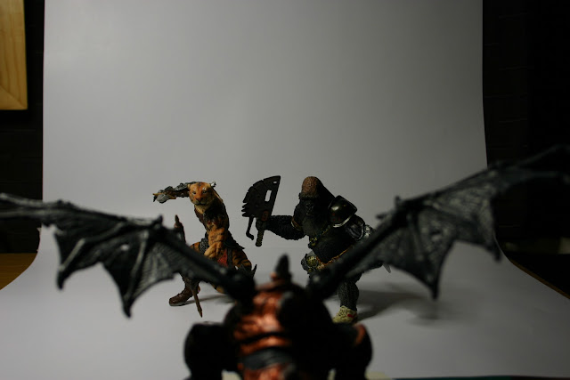
So in addition to this I have taken a few photos to convey different visual compositions using the same elements -
(I added a little story afterwards to help with the narrative ;p)
 |
| Tiger-Man wandered around, lost in a vast dungeon. |
 |
| He cautiously keeps his weapons raised as he travels deeper into the unknown. |
 |
| He pauses as his cat-like instincts become aware of eyes studying him from elsewhere. |
 |
| His instincts are true as we behold he is being observed from above. |
 |
| It appears he is being stalked by an armed adversary. |
 |
| There must be bad blood between the two as the shadowy foe can barely hold back his contempt for Tiger-Man. |
 |
| Ahead of Tiger-Man a shape detaches itself from the inky blackness. |
 |
| It is his old nemesis Cy-Gorilla! |
 |
| It appears the only way out of this dungeon is through Cy-Gorilla. |
 |
| "Prepare for death, you overgrown puss!" |
 |
| "You've skinned your last cat, Ape!" |
 |
| The feline's goading sends the Ape into a red rage. |
 |
| They circle one another in the narrow chamber daring the other to strike first. |
 |
| The long feud between these two warriors leaves all sense aside as a tumult builds in the stone surroundings. |
 |
| "What is this noise?" "More Cat antics?" |
 |
| "I thought this was your doing, Monkey Balls" |
 |
| Before the Ape can retort a great shape crashes through the chamber. "DRAGON!" cries the Cat "Look out!" |
 |
| The two warriors stare in disbelief as the Great Wyrm turns for another strafing run. |
 |
| The two old enemies quickly dive behind cover. "This is your fault Vermin" shouts the Ape over the deafening roar of the Dragon. |
 |
| They rise to meet their new adversary as it crashes to the chamber floor. |
 |
| The Gorilla realises with some resistance that there is only one option. "Although it pains me to say this. Our best hope lies in an alliance against this flying Lizard!" |
 |
| He can't let the Feline think him weak for suggesting such an action. "Unless you think you can escape here without facing me Scaredy Cat!" |
 |
| Begrudgingly the Cat concedes. "For once we are in agreement" "We must combine our efforts" |
 |
| Once again the two warriors ready themselves for combat. This time against a common foe. "If we perish this night Banana Brains, I'd just like to remind you that you stink!" "Likewise 9 Lives!" says the Ape with a grin. |
 |
| "TO THE DEATH!" |
Apologies for the rather crude presentation.
I'm sure it is possible to rearrange these pictures to convey a different narrative.
One of my favourite methods of visual storytelling is when your eye is directed to focus in certain areas of the image and is subtly held there whilst the scene plays out.
It is only when there is a drastic shift from one scene to another that you realise you have been holding your gaze there for so long.
The most important thing for us to remember as artist is to keep in mind the rules of composition and to consider the equally effective use of Visual Mass within your compositions.
Certain elements of an image attract our attention more than others. This is essentially what Visual Mass describes.
Using the Rule of Thirds the most important elements are placed nearer or along the imaginary lines that intersect one another. These regions can now be used to better effect.
For example, our attention can be directed to one side of an image rather than dead center.
The red glow around the center of this image pulls our eyes to it like a magnet.
This is a good example of Visual Mass. Colours can be great indicators of where we want our viewers to look.
A landscape painting can be given more breathing room by revealing more sky.
Or in the case of my recent painting of Bradgate Park cropped to give a better balance to the composition.
 |
| Before |
 |
| After (16:9 ratio) |
Now the whole painting is more balanced and the key elements lay along the lines of interest.
Although I am still toying with the idea of adding a human somewhere.
I read in a recent article that we are instantly drawn to depictions of human life in images.
They become an instant point of interest.
So I need to be careful exactly where I place them, if at all.
Thinking about it now it would probably detract from the positioning of the dog.


